Conservation Northwest Brand Refresh
Conservation Northwest is a 30 year old non-profit organization dedicated to maintaining environments and wildlife throughout British Columbia, Washington, and Idaho. Conservation Northwest is unique in that they are driven by science and data to further their mission of restoring and sustaining the local ecosystem. The organization consists of members and volunteers who partner with farmers, corporations, and advocate in legislation to affect long term change.
Objective:
Create a streamlined, consistent brand design for use across web and print media that effectively communicates the nonprofit’s mission and values to donors, volunteers, and members.

Whiteboarding session to define and identify the company’s mission and values
Existing Brand Design for Conservation Northwest

Tonal Territories of Conservation Northwest
Timeline:
10 Weeks
Tools and Skills:
Research
Brand Design
Typography
Illustration
Animation
Video Editing
Adobe Illustrator
Adobe Photoshop
Adobe InDesign
Adobe AfterEffects
Role:
Brand Design, Layout, and Visual Design,
Collaborators:
Deb Sary, Brand Design, Layout, and Web Design
Research:
Our research began with developing a deep understanding of the mission and actions of Conservation Northwest. We spent time defining a vocabulary, both verbal and visual, to effectively convey the existing brand, and expand with our brand refresh.
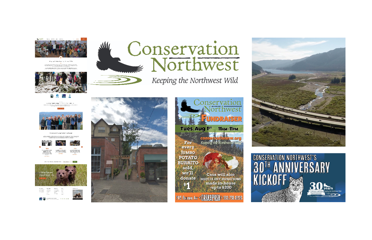
Current Materials
We closely examined the existing branded materials for Conservation Northwest. We compared materials to each other to determine consistency and what we deemed to be the most effective at communicating the values of the brand.
Tonal Territories
We identified 3 dominant traits of the brand that we wanted to communicate to the company’s audience. We then began collecting visual references that we believed represented these traits. From there, we further refined the visual and typographic vocabulary into moodboard specific to Conservation Northwest, and began to iterate logomarks and identity assets. We compared many different typefaces, and experimented with visual icons.

Moodboard inspired by Conservation Northwest
Logomark
From there, we further refined the visual and typographic vocabulary into a moodboard specific to Conservation Northwest, and began to iterate logomarks and identity assets. We compared many different typefaces, and experimented with visual icons.
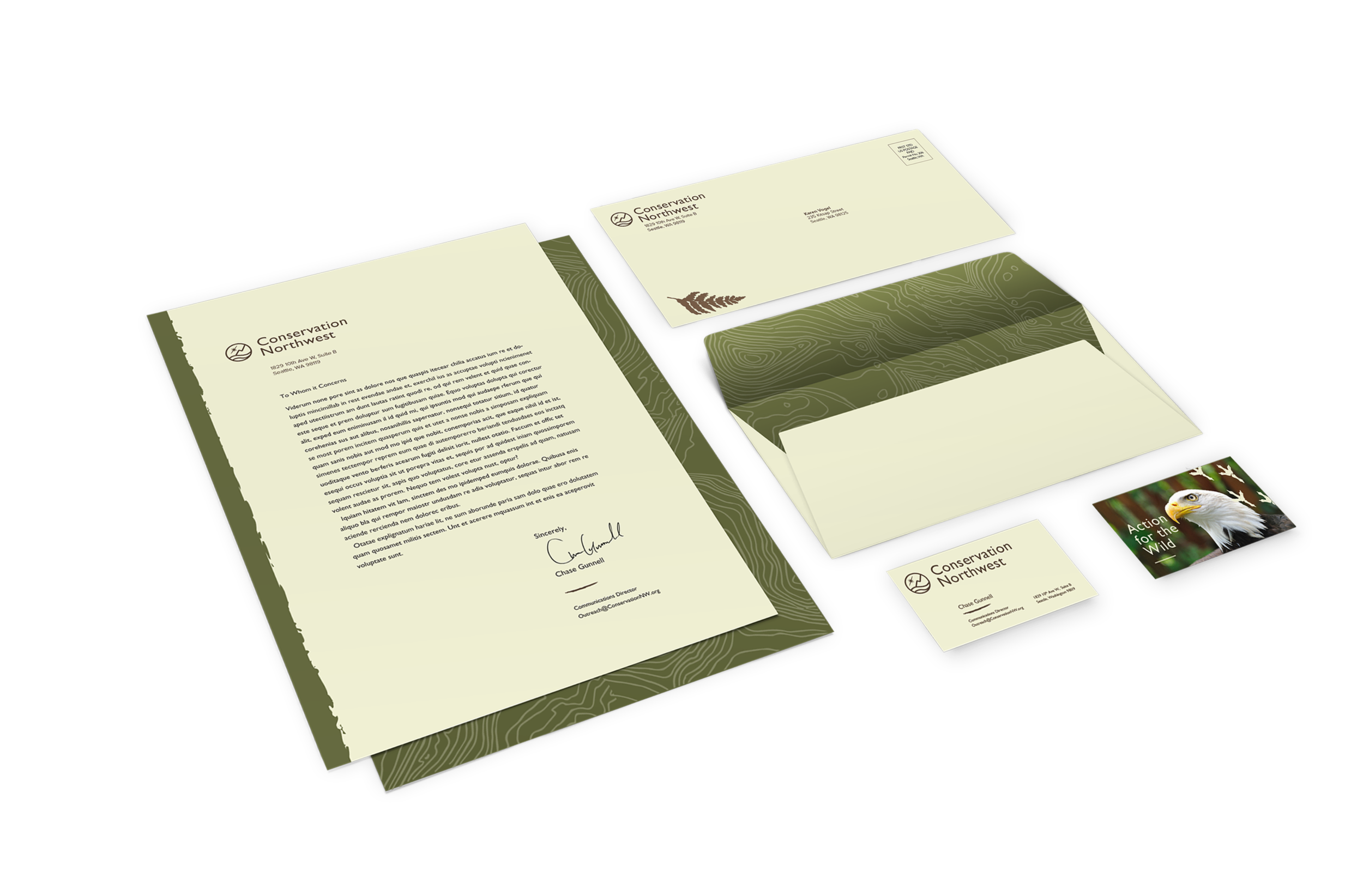
We decided to keep the logo simple, using a clear sans serif typeface, and a subtle image mark to convey a sense of casual professionals focused on relating their passion for the environment to their audience. The corresponding image mark is illustrative of the environment Conservation Northwest is dedicated to protecting: mountains and water where humans and animals may coexist and thrive.
The logo became our guiding star throughout the project. With each piece of media we developed, the next seemed to flow naturally. The identity suite gave us a more thorough grasp of how to use type across media.


